© A. Capolongo 2025
Designed with love (and lots of caffeine)

GRBS: Grand River Blues Society IA Redesign
Redesigning the information architecture (IA) of GRBS website to better serve its members and to create more memberships, and clearly displayed information
Project Overview
Timeline
My role
Tools used
The Grand River Blues Society (GRBS) website aims to promote the blues in the Grand River area through events, camps, education programs, and community engagement. However, the existing website presents significant usability challenges that hinder user engagement and goal achievement. This case study examines how research and iterative design improved the site's user experience to align with its objectives of increasing donations, memberships, and participation.
September-December 2024
Project Lead, Lead Information Architect, UX Researcher
Figma, OptimalWorkshop, Excel, ScreamingFrog, Microsoft Word
Tree Testing Analysis:
Optimal Workshop
Task Overview
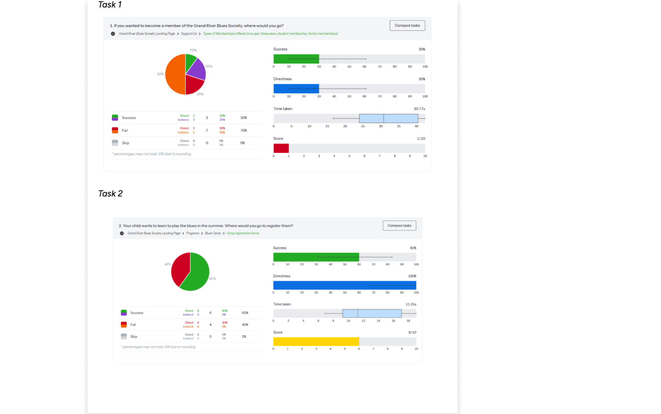
Task 1:
Find where to become a member of the Grand River Blues Society
Starting point: Home page
Target: Types of Membership Offered
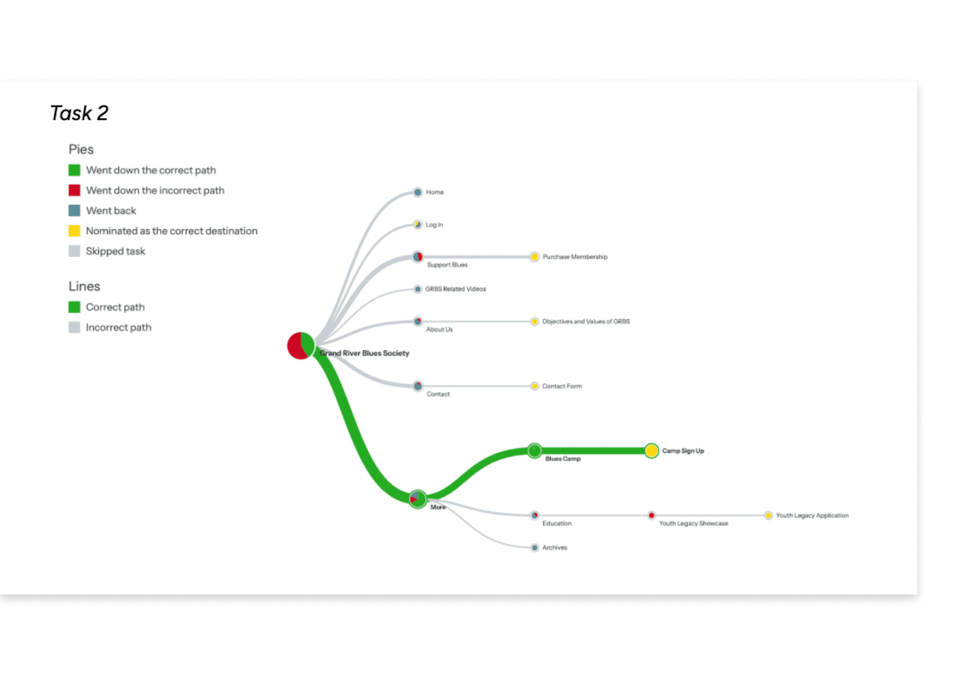
Task 2:
Locate Blues Camp registration for children's summer program
Starting point: Home page
Target: Camp Registration Forms
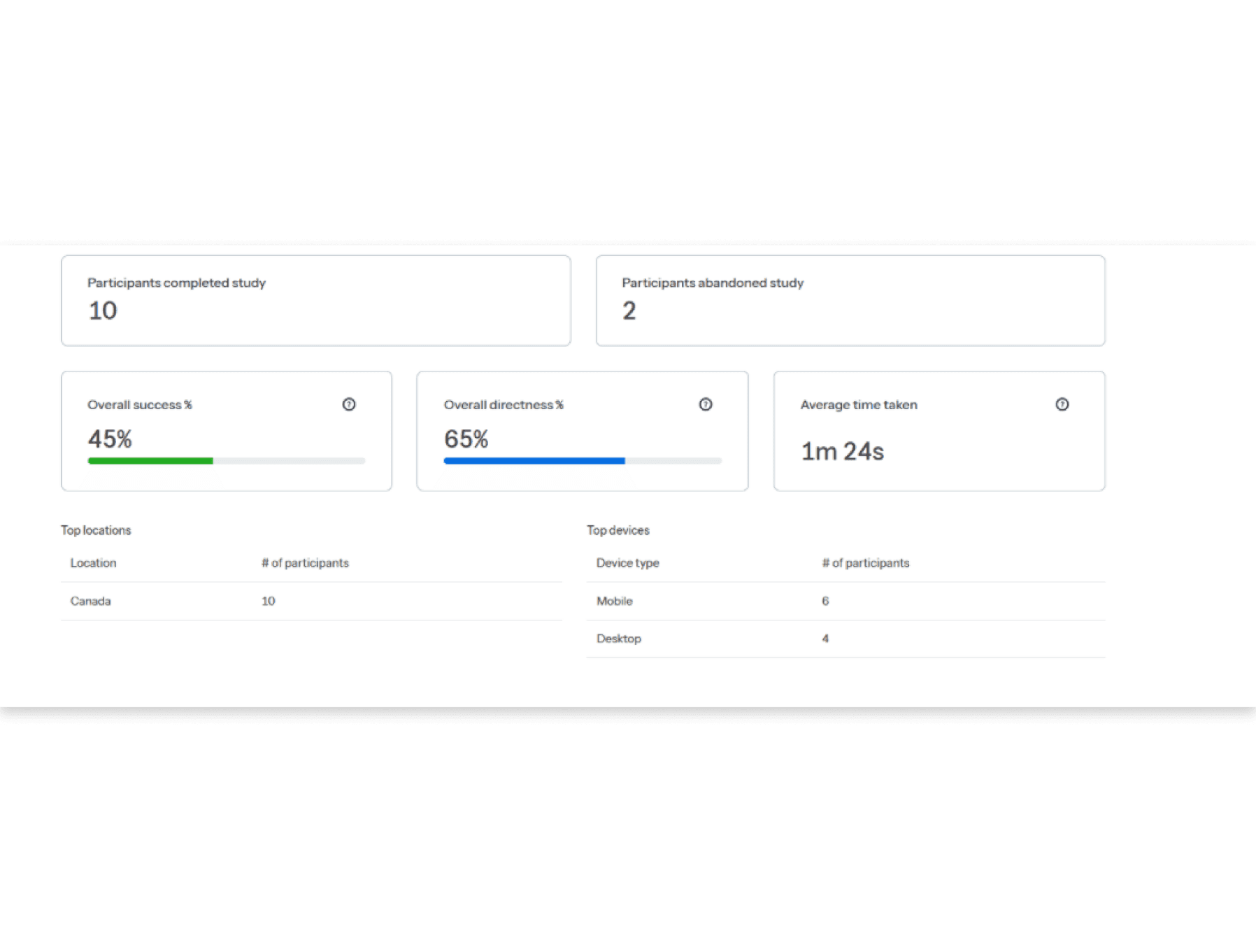
Tree Test A Results
Study Overview
Task Overview

Destination Overview

Task Statistics

Task 1 Pietree

Task 2 Pietree
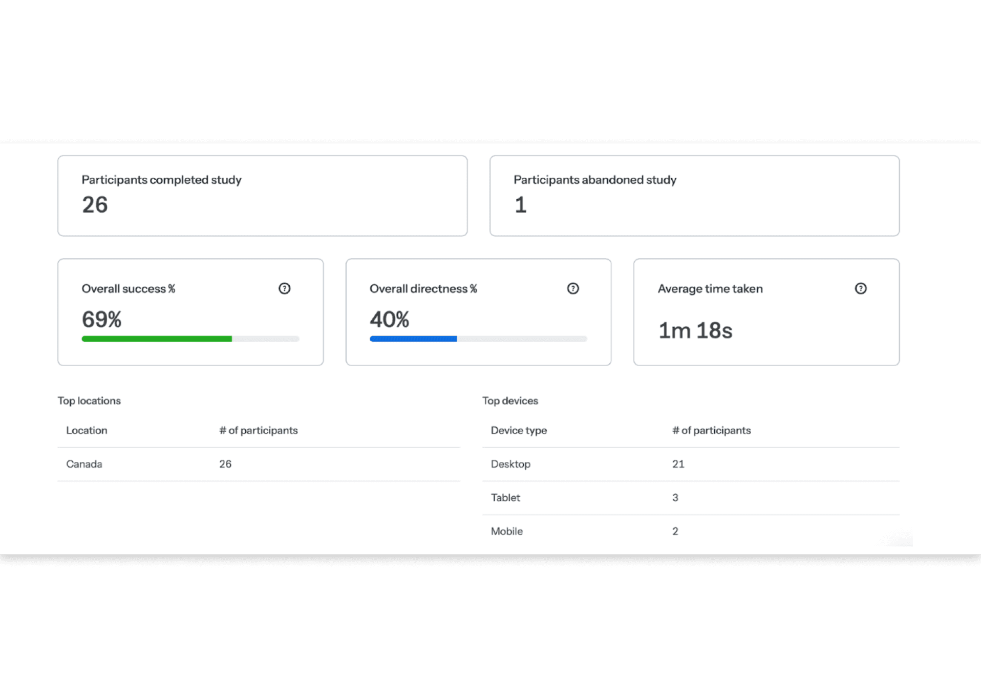
Tree Test B Results
Study Overview
Task Overview

Destination Overview

Task Statistics
Task 1 Pietree

Task 2 Pietree

Comparative Analysis
Success Rates
Task 1: 73% → 30%
Task 2: 65% → 60%
Direct Success
Task 1: 38% → 30%
Task 2: 42% → 100%
What we found with this data:
Navigation Structure Changes
Tree Test A reflected the existing site's broad and shallow navigation, with a deep "More" tab containing critical content.
Tree Test B streamlined the structure by:
Reducing labels from 13 to 5
Eliminating the "More" tab
Introducing a "Programs" section
Task Performance & Insights
1. Membership Information
Tree Test A:
Membership under "Join and Support" - 73% success, 19-second average time
Tree Test B:
Changed to "Support Us" - 30% success, 30+ second average time
Finding:
Label clarity is crucial. "Support Us" led to misinterpretation.
2. Blues Camp Discovery
Hidden under "More" - 42% directness, 25-second average time
Tree Test A:
Under "Programs" - 100% directness, <12-second average time
Tree Test B:
Well-labeled categories improve navigation efficiency
Finding:
Key Takeaways
✓
Clear, descriptive labels matter – Ambiguous terms lead to confusion and slower task completion
✓
Simplifying navigation improves efficiency – Reducing labels from 13 to 5 eliminated unnecessary complexity
✓
Eliminating the "More" tab boosted success rates – Relocating key content under intuitive categories improved directness
Time to Complete
Task 1: 19.95s → 30.77s
Task 2: 24.98s → 11.25s
*note the restructuring of the Grand River Blues Society (GRBS) website’s information architecture was guided by participant card sort data directly from OptimalWorkshop visualizations. This process involved filtering outliers, resolving label misinterpretations, and refining content relationships to improve navigation and align with user expectations. Our key findings came straight from that data.
Problems
On this site, there were 3 high-level issues we identified. Below exists each problem we found as a team.

Confusing and Redundant Navigation Structure
The original global navigation bar had eight labels, which users found unclear, redundant, and overly complex.
Participants in card sorting exercises naturally grouped content into a median of six categories, indicating that the current structure included unnecessary labels.
The "More" menu was particularly problematic, adding confusion rather than helping users find relevant content.

Ineffective Local Navigation & Labeling Issues
The local navigation bar was inconsistent and failed to prioritize key user goals, such as accessing membership details or event information.
Labels were unclear or misleading, leading to difficulty in task completion.
Example: Changing "Join and Support" to "Support Us" resulted in a 40% drop in task success rate, as users associated it with donations rather than memberships.

Lack of Effective Search & Wayfinding Features
The absence of a global search function made finding specific content cumbersome.
Users relied heavily on navigation menus instead of being able to search for specific topics, events, or memberships.
Breadcrumb navigation was missing, making it difficult for users to understand their location within the site hierarchy.
Card Sorting Analysis: Optimal Workshop
Our card sorting study with 27 participants revealed clear patterns in how users expect content to be organized. The similarity matrix and dendrogram analysis below led to our final five-category structure.
Similarity Matrix
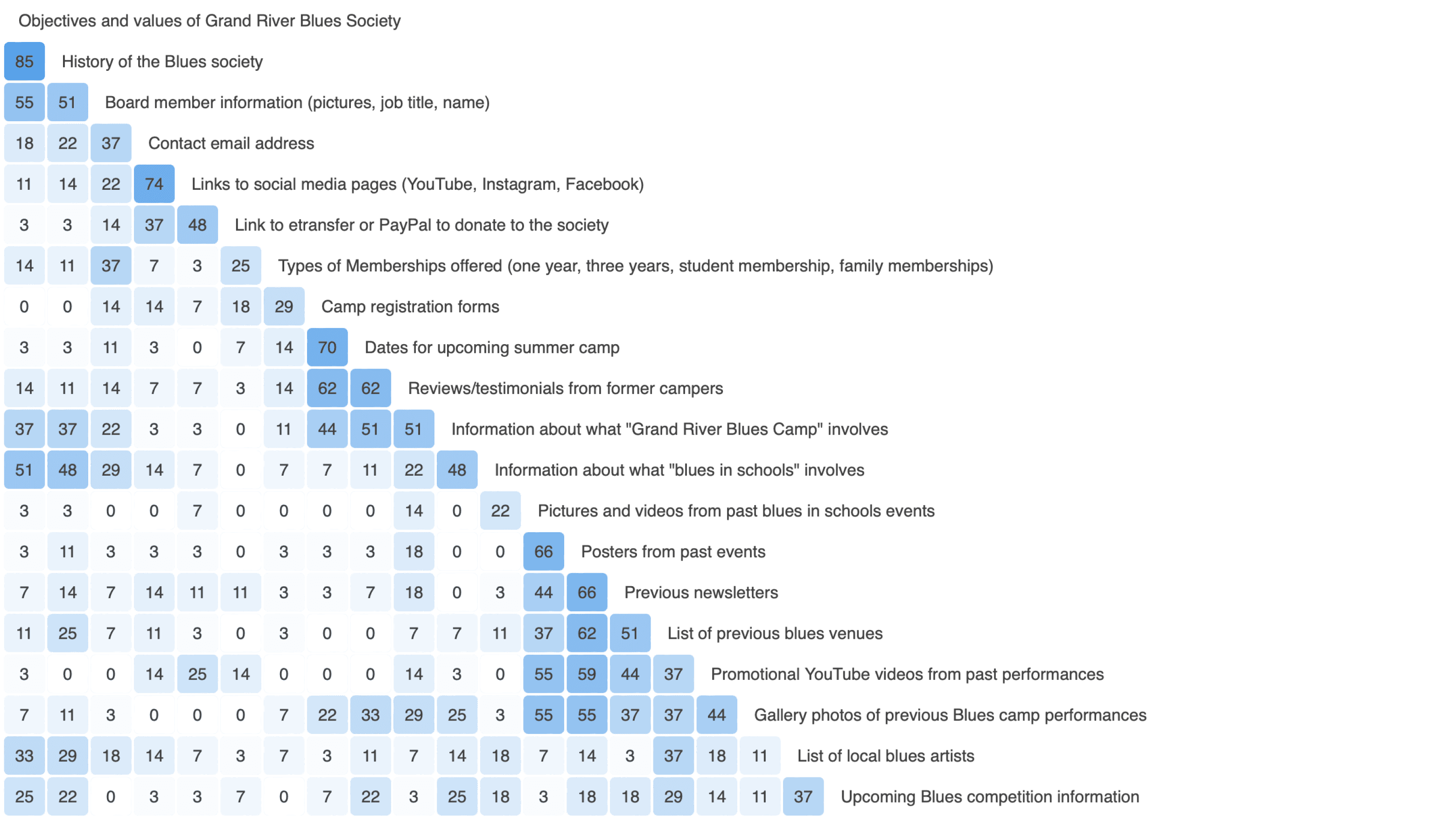
Key Similarities
"Objective and Values" + "History of the Blues Society"
85% Similarity:
"Contact email address" + "links to social media pages"
75% Similarity:
"Camp registration forms" + "Dates for upcoming summer camp"
70% Similarity:
Dendrogram Analysis

Notable Patterns
Organizational information consistently clustered together
Event information naturally split between past and upcoming
Educational programs showed strong relationships
Membership information remained distinct
Resulting Categories
Final Navigation Structure
About Us
Programs
Past Events
Upcoming Events
Support Us
Sitemap Redesign
The redesigned sitemap improves event discovery with faceted search, allowing users to filter by title, date, location, time, and artist for quick access. Additionally, an event submission feature lets organizers easily add events with key details, keeping listings fresh and engaging.

About
Programs
Membership
Events
Support
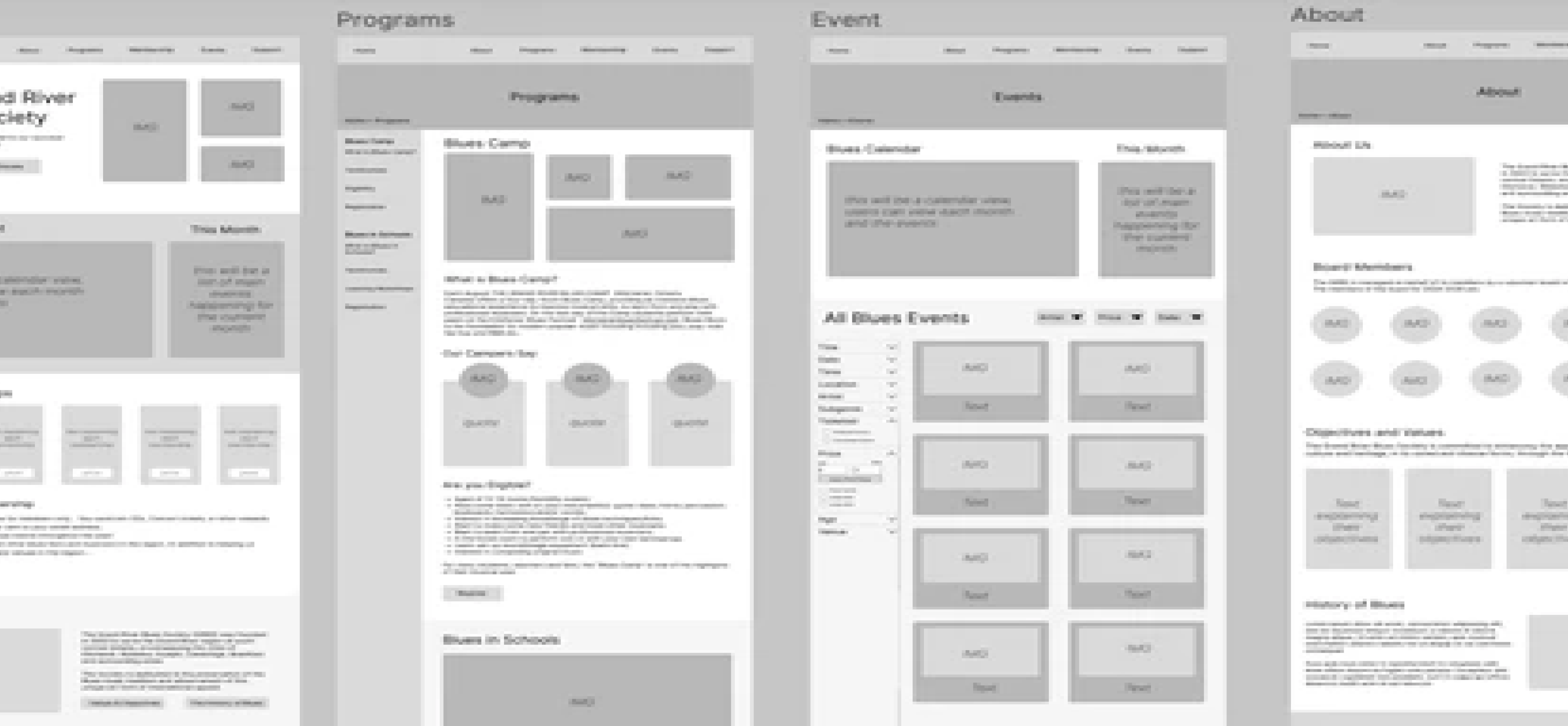
GRBS Wireframes
Comprehensive website structure showcasing the main sections: Home, Programs, Events, and About. Each wireframe demonstrates clear navigation and content hierarchy for optimal user experience.
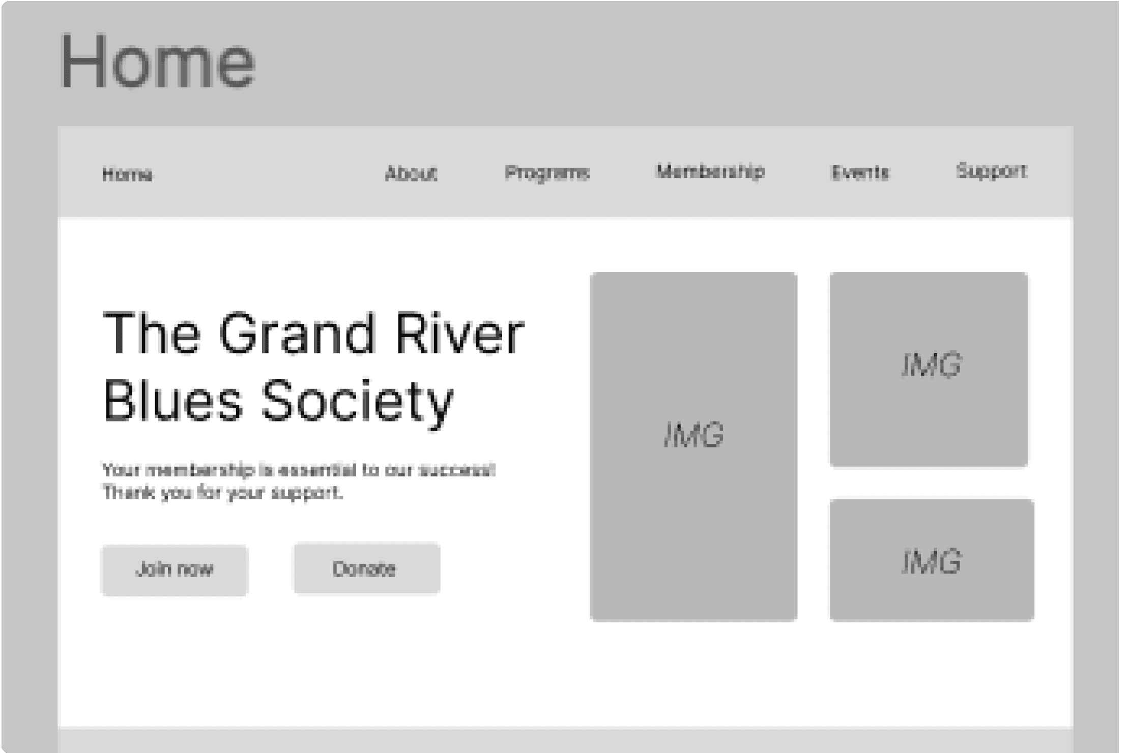
Home
Hero section with featured content, news highlights, and quick navigation to key areas

Events
Calendar view of upcoming events with filtering and search capabilities
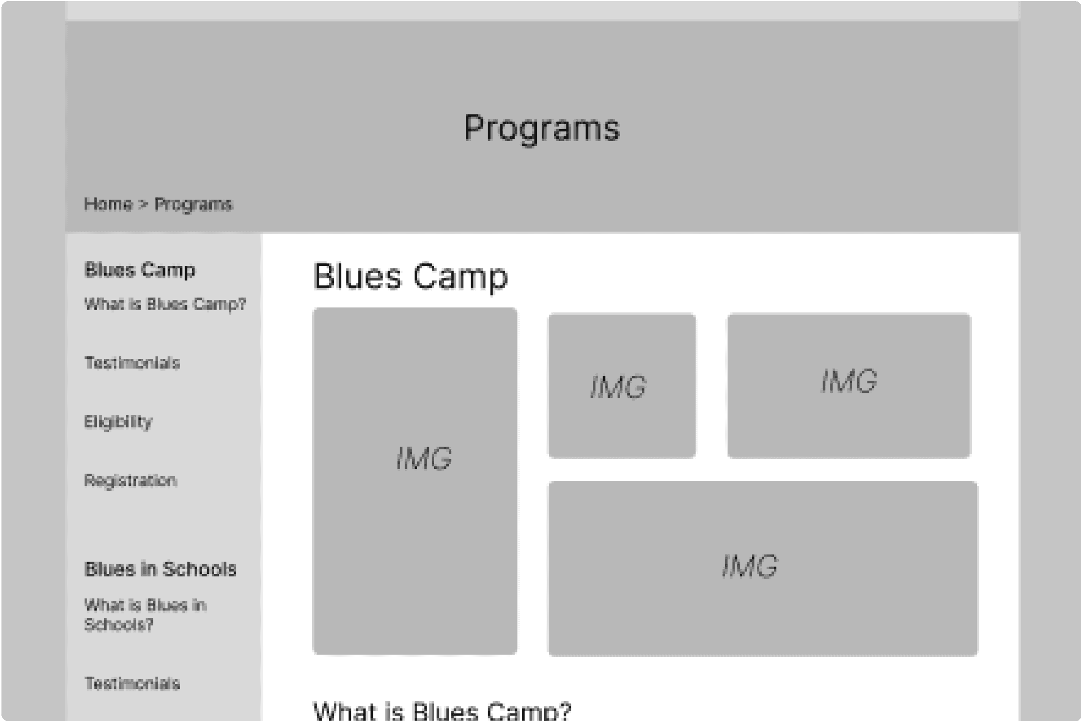
Programs
Overview of available programs, education, and registration information

About
Organization history, mission statement, and team information
Navigation Systems
Key navigation elements that guide users through our site.
Global Navigation
Clear, horizontal menu structure with essential categories: Home, About, Programs, Membership, Events, and Support.
Home
About
Programs
Membership
Events
Support
Contextual Navigation
Smart crosslinking between related pages regardless of their primary category.
Board Member Information
Membership
Support
Utility Navigation
Search...
Quick Links
Shortcuts
Supplemental Navigation
Home
/
Programs
/
Blues in Schools
Clear pathways back to parent pages and main sections.
Project Reflection & Next Steps
Reflection
This project served as my introduction to Information Architecture, proving to be an incredibly engaging learning experience. Working through the navigation systems and user flows helped me understand how thoughtful organization impacts user experience. The process of mapping out user journeys and creating intuitive pathways was both challenging and rewarding.
Next Steps
Mid-Fidelity Prototype
Create interactive prototypes to test navigation flows and basic interactions. Focus on layout structure and content hierarchy.
Initial Testing
Conduct user testing sessions with 5-7 participants to validate navigation patterns and identify potential usability issues.
Final Iteration
Incorporate feedback and refine the design. Create high-fidelity mockups with complete styling and interactions.
Launch Preparation
Final round of testing, documentation preparation, and stakeholder presentations before deployment.
User Groups
Blues Fans
Seeking event information, volunteer opportunities, and membership options
Musicians
Looking to join the society, view past performances, and volunteer
Parents & Teachers
Interested in educational programs and blues camps
Search Behaviors
Fact Retrieval
Users seeking specific information about events or programs
Known-Item Discovery
Looking for specific resources or past events
Exploratory Searching
Browsing available programs and opportunities
Content Inventory Analysis
Through comprehensive content mapping using Screaming Frog SEO, we identified key areas for improvement in the website's information architecture. This analysis revealed opportunities to streamline navigation and enhance content accessibility.
